Tuesday, January 6, 2015

Practice collage


My collage's theme was based on the 50's-70's. I wanted to incorporate black and white elements because TVs were still black and white up until 1967 and then I included tie-dye because of the 70's. Newspaper was a common thing back in this time period and so were VW bugs. The Beatles, Elvis Presley, and Marilyn Monroe were all popular stars and were partially what this time period was known for. To stick the newspaper to the paper I put gel underneath the newspaper then gel and a little water over top of it. After that I would rub the newspaper and press it down then I took it off and a thin layer would stay in most spots. The bare spots looked cool but I stuck the newspaper down this way mainly because lack of time. In all the bare spots I added water color which gave it a really cool torn and old look. After the background was finished I pasted one of The Beatles album cover over top and replaced two of the members with Elvis and Marilyn buy pasting them over top. Then I went around the edges of the picture and added some more newspaper and water color. To the left of that page is another part of the collage which I haven't finished. My plan for the right side is to add some newspaper and water color to the left of the newspaper. Then I will have the VW bug come out of the bottom right corner on top of the newspaper and water color shooting into the tie-dye. I really like how the left side turned out so I think the right will look great! I love this time period because of the music and lifestyle I have seen in it. My new records (one being a Beatles album) inspired this piece. I also love buggies because they are so cute (especially the old ones)! I did have some struggles with this piece though. The water color wasn't looking the way I wanted it to so I had to work with it for a while and the newspaper was hard to make stick with the method I used. Overall I really enjoyed learning how to make a meaningful collage.

Sunday, January 4, 2015

Collage

I Take Risks

I had a vision to start off with but as I was working on my collage I started running low on time and had to make other plans. I was not sure how cut up mountains from a magazine and toothpick mountains would look together but it turned way better than expected. The grass was the most time consuming thing in the whole project because I had to take different pictures of grass from different magazines and cut them into different shapes then paste them together based on shape and shade. I had a lot of trouble finding enough grass so I decided I would just have to print out some grass and hope it looked as glossy and the other two areas of grass. The risk I took that did not work out so well was with the sky. I sprinkled sand and glitter over the blue sky hoping for a cool texture but all it ended up doing was clumping together and ruining the paint. Then I painted the the matte gel over top hoping to fade the sky some but the canvas was so ruff that it just came out as blotchy white smudges. In the end I just painted the blue sky back over it and placed cotton balls as clouds. 

I Communicate Through My Work

The assignment was to create a story through a collage so that is exactly what I did. I find the creativity of fantasies very intriguing so I wanted to use the fantasy element to tell my story. My piece does not have a lot of story line to it but I wanted the viewer to be able to use their imagination to create their own story. There is a light side with a tree and flowers and green grass and then there is a dark side with dark twisted trees and vines and black fog. The light side symbolizes the good in a fairytale and the dark side symbolizes the evil in a fairytale. 

I Reflect

I stepped back and analyzed my collage many times throughout the process of making it. I looked it over after every element I added. I think my idea was too detailed for the amount of time and effort I had to put into the project. I was planning on adding a house and many more trees and flowers but it was not practical so I worked with what I had. Many ideas I thought would work out didn't such as having an abundant amount of grass pictures, the flowers aren't my favorite, the original sky was ugly, and the background of the evil forest doesn't flow very well. The collage looks great though! The mountains are my favorite part because the magazine mountains give it a more realistic look but the toothpicks look more fairytale like.

Sunday, December 7, 2014

Up-Close Pine cone


These are my sketches


This is my final


I Create Original Art

How did you use your own unique ideas in your work? The idea of a pine cone I thought was pretty unique because it was something you don't seen drawn very often especially up close. The angle of the pine cone was also very unique and the details were different. 


Did you use a source for inspiration, then combine it with your own ideas to make it original? The fact that it was fall was very inspiring to me. I love fall and how the nature looks during this time. All I could think about is beautifully colored leaves all around me and then it hit me (not literally)! I could draw a pine cone! Leaves are so commonly drawn especially up close so I wanted to do something different but still related to nature. A pine cone was has rich browns and interesting shapes so it was perfect for something that had to have detail.


I Reflect

When did you step back and analyze you work during this project?  I stepped back and really analyzed my work at the end. I analyzed throughout the project but I really payed attention to all of the little details at the end. Now that I look at it I see I could've improved on some things. The transition of brown from the middle of the branch to the edges is kind of choppy and there is a large color variation there. Also some the branches are crooked and not pointing the same way. Lastly I think I could've added a little more detail and do a better job on the detail I did add. Overall the drawing is really unique and the colors look great. I like how I shaded underneath each branch a little, it gave depth. 


Did you pick a material or technique that was new or different over something that was familiar? I picked a familiar material. I used colored pencils because I had experience with them and I knew this project would be challenging if I wanted a real looking effect. I had to use multiple colors to get all the effects. I used black, tan/brown, and red/brown. 


 I Developed My Art Making Skills

Did you learn new techniques or processes as part of the work for this project? Not really because all I did was shade and color and create depth which I had already done before.


Did you gain skill with familiar materials? Yes I gained skill with the Prismacolor colored pencils which I had only used once. I  learned how to shade better with them and create different effects with the way I went back over the colors I had already put down. 


Monday, December 1, 2014

Clay Food project

I really enjoyed this project! I think my clay pieces turned out really well and would love to work with clay more often. My perfectionist side definetly came out while doing this project but I didn't have enough time to make every detail flawless. If I were to change something abut my pieces I would make the bowl smoother, put some support under to tomatoe soup so its shape doesn't blend into the bowl, and add more texture, value and color variations. Although I really like how the cheese in my grilled cheese turned out. Overall it was a fun project and i'm happy with the results.

Wednesday, November 19, 2014

Lollipop and Jolly Rancher

Lollipop


I really like working with the colored pencils, especially the nicer colored pencils because they blend very well. It is easy to create value with the colored pencils and they do not smear or make it hard to go back over and fix something or add value. I could've created more value than I did now that I look
at it on my computer screen. Overall I really enjoyed the colored pencils.


Jolly Rancher


I did not like the oil pastels very much because it was harder to blend colors and create value. The colors that I did not want blended would blend and there is only so many times you can go over the paper in one spot. I also had trouble with giving the effect of a wrapper around the jolly rancher. But I did like how the words on the wrapper turned out. Overall I think it was good to experiement with oil pastels to figure out what mediums I like best.

Thursday, October 23, 2014

Painting in the Style of a Famous Artist

Paul Gauguin Style Painting

The artist I researched was Paul Gauguin. In his artwork he used simple shapes, bright colors and a thick coat of paint. I decided to pain a picture the mountains with a sunset behind them. First I did a couple sketches in my sketchbook. Then I sketched it out on my canvas and painted on my tonal. Next I painted the grass and bright-ish green with a thick coat of paint and then I did the mountains a light blue/grey color. All of those shapes were very simple. Last I painted the sky and I used very bright and bold colors. The sky looked rainbow almost.


I Take Risks

Did you try something that you weren't sure of as part of this project? Yes, I painted a very colorful sunset and at first I wasn't sure if I would be able to blend the colors of the sunset very well. 
Did you pick a material or technique that was new or different over something familiar? Yes, I used very bright colors and thick coats of paint. I don't usually paint with acrylic paint either, I usually use oil paints so it was a little bit more difficult.

I Create Original Art

How did you use your own unique ideas in your work? I came up with the idea of painting a really bright and colorful sunset behind the simple mountains. I wanted to add a splash of color to the painting.
Did you use a source for inspiration, then combine it with your own ideas to make it original? I imagined an image in my head of the mountains with the sunset in the background so I looked up some images on the computer to get a clearer image in my head. I also looked up some paintings of Paul Gauguin so I could understand his style better.

I Reflect

When did you step back and analyze your work during this project? I analyzed throughout the process of painting it but I really got to analyze it once I finished painting. Overall I think the painting turned out pretty decent but I couldve added more detail.
Did you consider how your ideas would work before you tried them? I did consider how my ideas would work before I tried them and most ideas worked but my main challenge was blending the colors.


Tuesday, September 23, 2014

Perspective


These were my reference pictures that I used to create my compositional sketches. I took the bottom picture on the page to the left and the top picture on the page to the right.


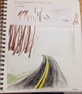
These are my compositional sketches. On the left page the top drawing is of mountains that fade into the distance with a sunset and the bottom is a road that disappears into the distance. The sketch on the right page is a compostional sketch and a final sketch but I just didn't finsih coloring it. 


This is my final copy. The blue of the sky didn't show up very well in the back!

I Create Original Art

How did you use your own unique ideas in your work? I tried to make the grass give the illusion of a hill and unlevel ground on the side of the road by changing the direction the grass pionted and grew. 

Did you use a source for inspiration, then combine it with your own ideas to make it original? I used a picture that I took myself when I was on vacation in the mountains for my inspiration. I changed some aspects like I didn't draw any leaves instead I left the trees bare and the ground just as grass. 

I Take Risks

Did you try something that you weren’t sure about as part of this project? Yes, I chose to draw a road in perspective instead of something with straight lines. I wasn't sure if I could make the road look like it disappeared in the distance but I think it turned out pretty well. 

Did you pick a material or technique that was new or different over something that was familiar? Yes I picked putting things in perspective that weren't straight lines. The whole landscape had to look in perspective.

I Reflect

When did you step back and analyze you work during this project? I analyzed it throughout the process of making it. After each part I did like the grass or road I would step back and look at what I needed to fix and improve on. 

Did you consider how ideas would work before you tried them? Yes I did consider my ideas before I tried them but they did'nt always turn out how I planned. Like I wish I would've just shaded with pencil instead of using colored pencil because it doesnt look as detailed as I wanted it to look.